Letters from here

Cartas Daqui is a channel that tells stories about Brazil through a lens full of affection and memory, exploring our customs, details, and habits. This channel is a warm letter filled with beautiful accounts by journalist Francisco Kilgore.

The visual identity was built on the concept of local stamps—the kind we stick onto postcards to send to friends, sharing our experiences of a city or country we are discovering at that moment. Stamps featuring Brazilian objects and elements prevail throughout the visual language, accumulating more and more stories over time.

The brand’s typography features Ana Banana, created by designer Julia Lago from Plau, paired with snippets of Brazilian songs set in the Brasileiro font by Crystian Cruz.

Eunice

Eunice is an illustrated platform created to expand access to information about the climate crisis.

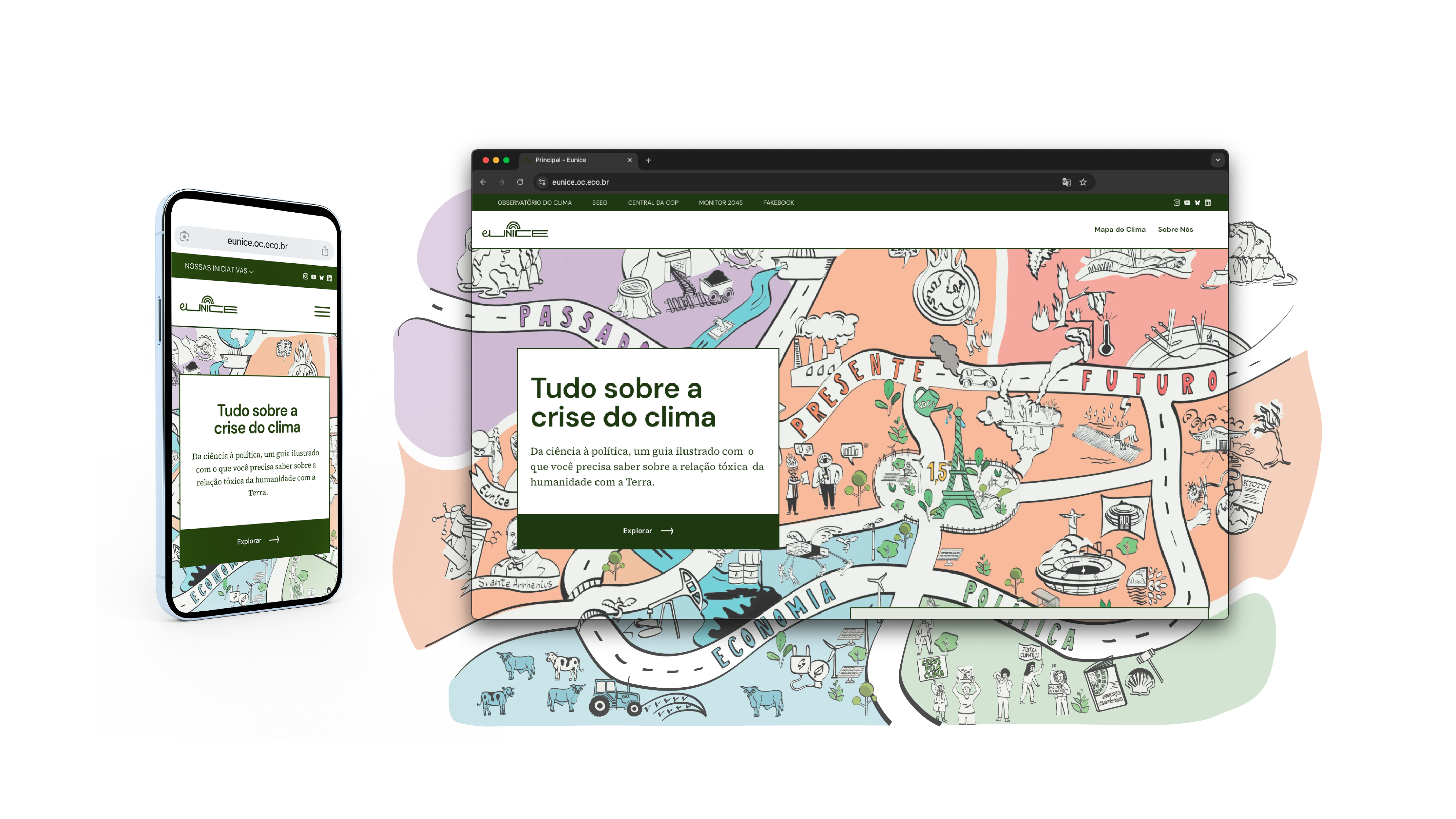
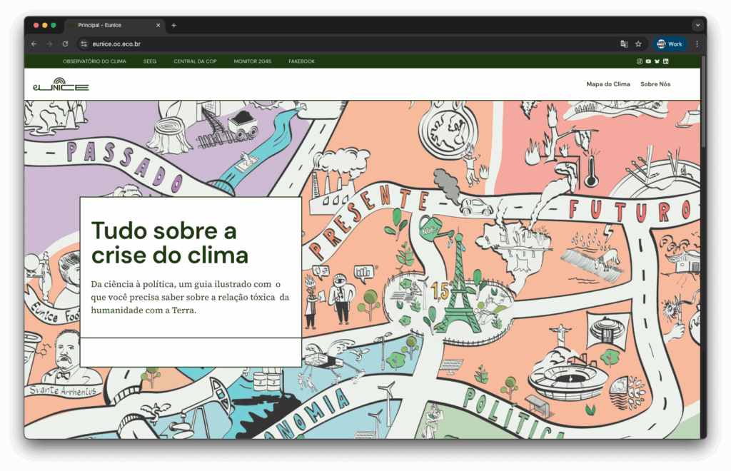
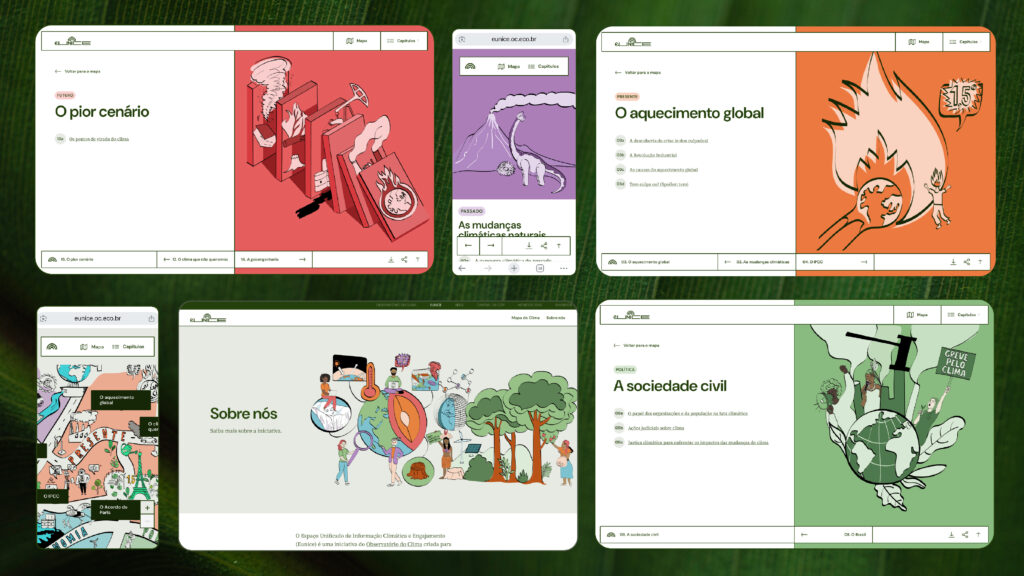
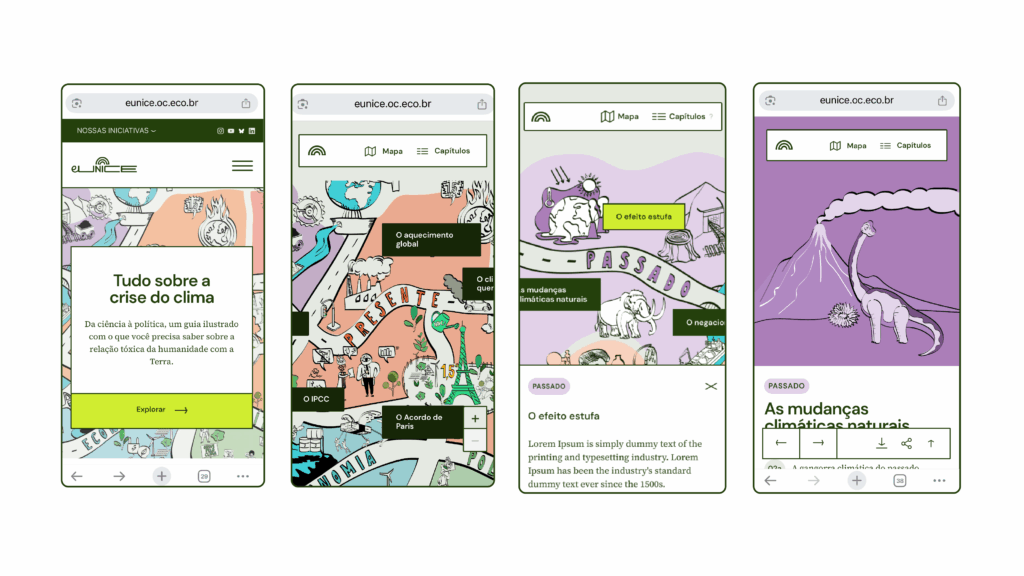
We illustrated an interactive map of a city that features key moments in the history of the global climate, divided into five “neighborhoods”: past, present, future, economy, and politics. The map invites users to explore topics such as the history of global warming, climate conventions, denialism, civil society, and more.

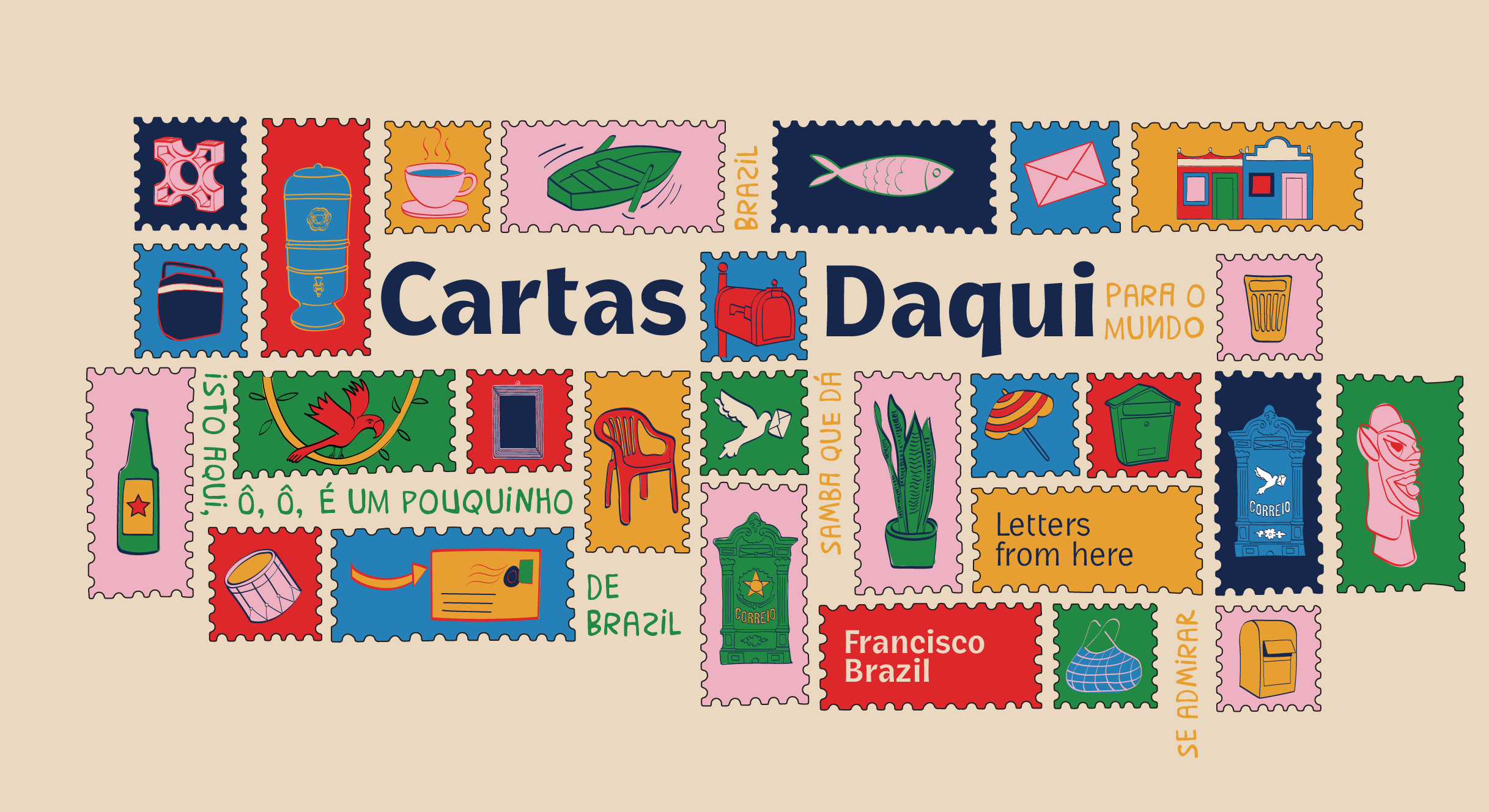
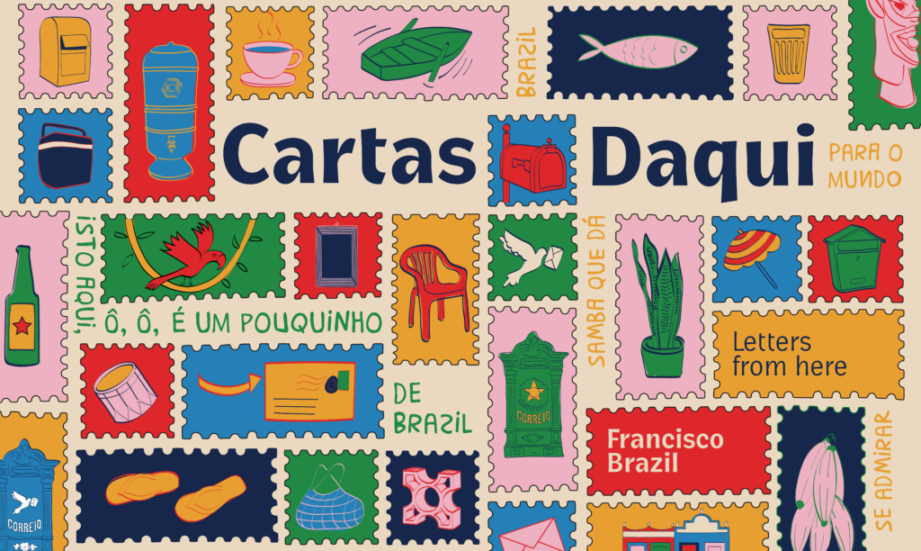
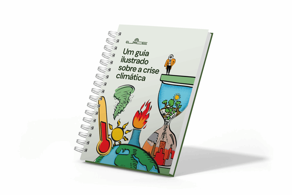
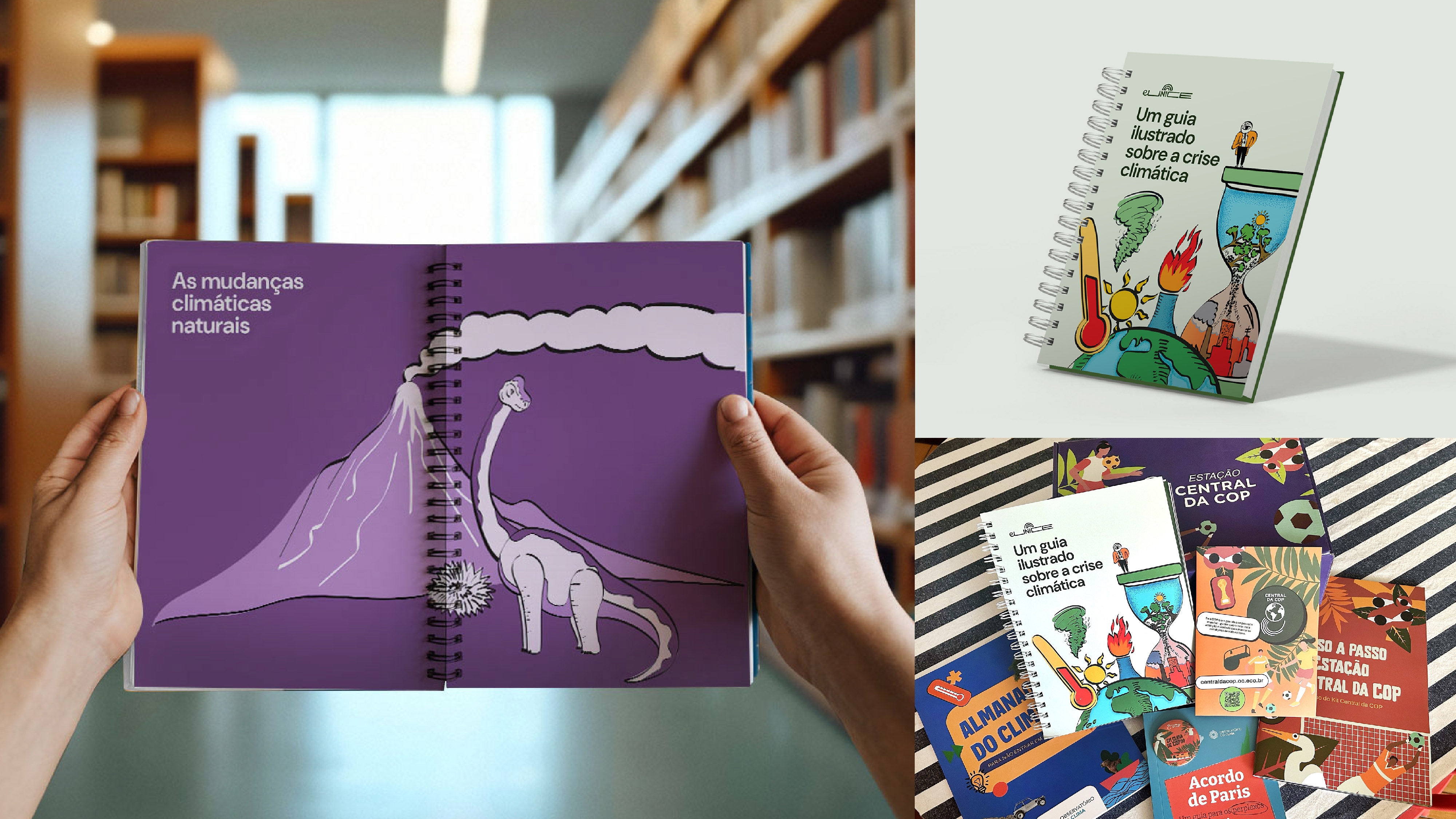
We created 120 illustrations to tell this story across 14 chapters, using a playful and ironic tone throughout the platform. In addition to the digital experience, the project was also published in print as a booklet titled An Illustrated Guide to the Climate Crisis, which is being distributed to leaders, environmentalists, and influencers ahead of COP30.

The climate map and the 120 illustrations were designed for the visual universe of the Eunice platform and its print version, the illustrated guide, which is being distributed in kits for COP30. The illustrated map serves as the entry point to the platform, as if the user were stepping into this city to navigate through different points in climate history.

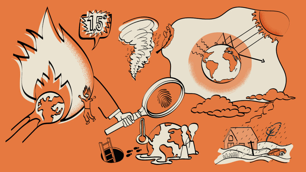
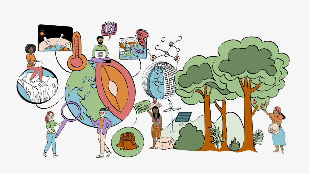
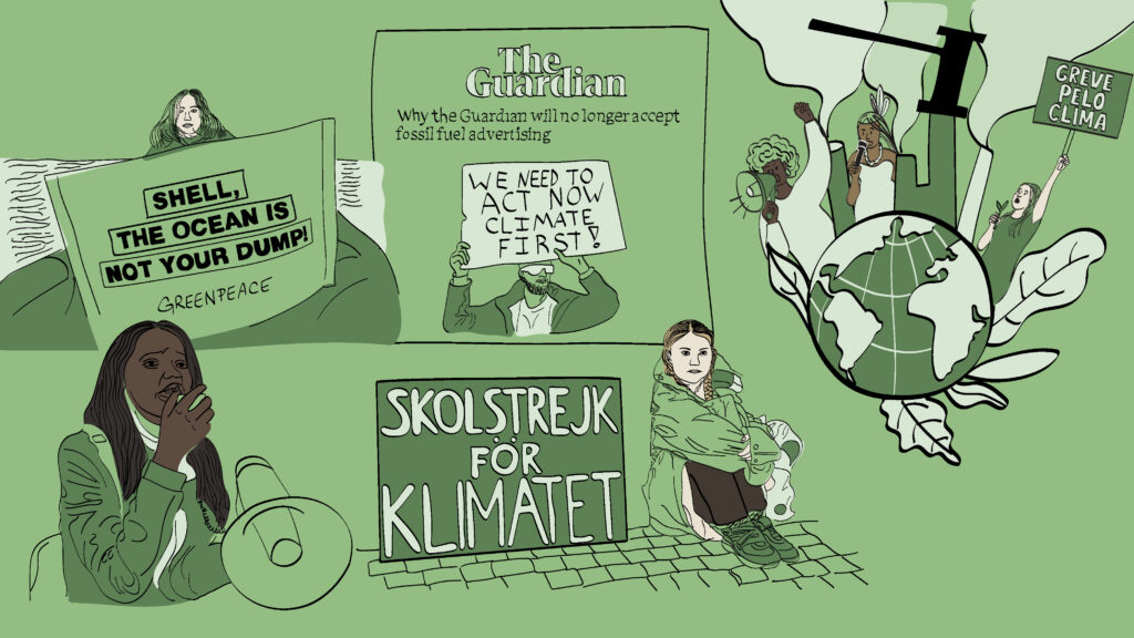
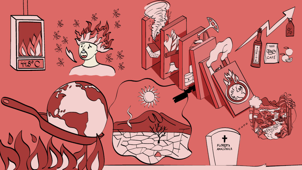
The illustrations were created digitally and inspired by political cartoons, using a critical and humorous tone to interpret a subject that is often overwhelming and paralyzing—like the climate crisis. Alongside the illustrations, the platform also features videos, infographics, audio content, and interactive tools.

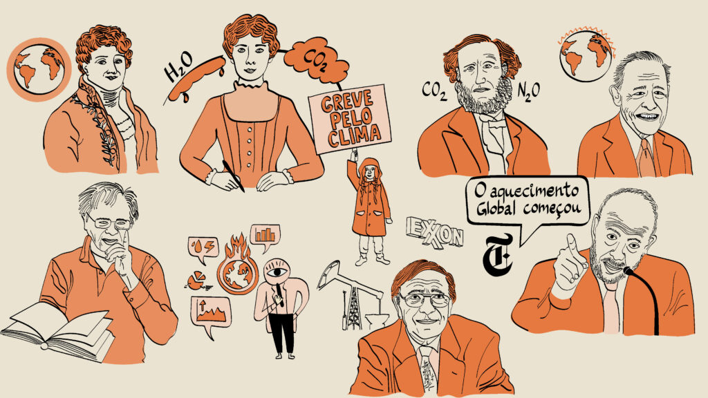
The project is named in honor of American scientist Eunice Foote, one of the discoverers of the greenhouse effect, whose contribution was erased from history simply because she was a woman.

The goal of the illustrations on the platform is to raise awareness and make the history and key data of the climate crisis clear and accessible. The idea was to use illustration to transform dense and complex content into something light, engaging, and easy to understand—reaching a wide audience: school teachers, environmental specialists, policymakers, and curious minds who want to learn more.

Eunice was conceived as a concrete contribution to the public climate debate in 2025, the year Brazil will host COP30. The platform was created to make the climate crisis easier to understand for the general public, and it will remain alive and updated over time—helping to strengthen the sense of belonging and connection to the future of the planet.

Credits: 
Ilustrations: Selográfico
Visual Identity: Selográfico e Saúba
Climate Map: Selográfico
Illustrated Guide: Selográfico
Design Lead: Thiago Cruz
User Experience: Bruna Cerasi
User Interface: Natália Soueid
Infographics: Mário Kanno
UX Writing: Observatório do Clima  
Development: Diego Ramalho

Guia ilustrado sobre a crise climática

Círculo 888 – Gestão de Resíduos

Círculo 888 is a non-profit organization that promotes the sustainable management of solid waste from the beauty industry, combining environmental innovation, social impact, and cultural appreciation. In its visual identity, waste takes center stage—because it is part of our lives, it becomes a key element in Círculo 888’s graphic language. This concept highlights waste not as the end of a cycle, but as an ongoing part of our lives, encouraging us to rethink its destination in a conscious and responsible way.

The brand is designed as a sticker or badge, similar to those used in social movements and protests, symbolizing a cause and a form of resistance. The graphic system revolves around the circle and its variations, reinforcing the idea of networks, community, and how our actions are interconnected within a larger chain.

This project is a visual identity that rethinks waste in an intelligent way, with respect for the environment. Círculo 888 is a platform for regeneration, inclusion, and awareness—transforming waste into regenerative resources. The visual identity aims to uplift and give value to a universe that is often ignored or marginalized, portraying it as something powerful and transformative. It seeks to reframe waste, regenerate the planet, support beauty salons, and empower communities to create an infinite cycle of sustainable impact.

The purpose of this identity is to help spread the ideas and values of Círculo 888, raising awareness, shifting mindsets, and creating opportunities for social inclusion through recycling, waste management, and pollution reduction. Círculo 888 aligns with the principles of the circular economy and the United Nations Sustainable Development Goals (SDGs), with the aim of becoming a national reference in environmental regeneration, social inclusion, and raising awareness within the beauty industry—ultimately establishing itself as an OSCIP (Civil Society Organization of Public Interest).

Health on Your Plate Website

Selográfico was invited by the studio Liquefeito to create illustrations for the new Health on Your Plate portal by the Brazilian Vegetarian Society. The goal of the project is to promote accessible scientific information about vegan nutrition. The portal aims to demystify misconceptions and provide practical guidance on how to adopt and maintain a balanced vegan diet at all stages of life, highlighting its health benefits—such as the prevention of chronic diseases—as well as its positive impact on the environment.

Just as every nutrient is essential for a complete and healthy diet, the typography was “sliced” to create a graphic texture, becoming part of this visual diet.

The Governance of Extra-Fiscal Policies

The book The Governance of Extra-Fiscal Policies: A Case Study of Tax Incentives in the State of Rio de Janeiro explores the intricate relationship between public revenue waivers and economic development. By unraveling the complexities of this connection, Priscila highlights the historical evolution of the fiscal state and its relationship with budgetary balance and public policy. Treating revenue waiver as a public policy in itself, she emphasizes the importance of governance for both prior evaluation and post-implementation monitoring.

To address data, indicators and targets, as well as socioeconomic, budgetary, and financial outcomes, we incorporated bar graphs as a symbolic element throughout the book’s visual identity—representing both the path and the steps taken—where the population is the most affected by these public policies.

CRIA – Eu e Você

Graphic design for CRIA’s new album Eu e Você. It was entirely developed with paper, where the lettering on the cover consists of small gears with textures and volume. The back cover features the names of the special guests in a cloud, as well as the names of the songs floating in this sky. CRIA’s songs are for children but also for adults, always conveying playful messages about childhood life. The group has performed on various stages across Brazil with multiple albums. Eu e Você was released in May 2025, accompanied by its first shows at the São Paulo Cultural Week and at Sala Cecília Meireles in Rio de Janeiro.

Cover Eu e Você

Poster of the lyrics of the album Eu e Você

Fio da Meada

Visual Identity of the Fio da Meada podcast, featuring interviews with Branca Vianna. Every Monday, Rádio Novelo presents an episode of these interviews to promote reflection and debate on various topics of our reality. The podcast has hosted personalities such as Eduardo Galindo, Nina da Hora, Paola Carosella, Cecília Olliveira, Patrícia Campos Mello, Vanessa Cavalieri, Felipe Neto, Lígia Gonçalves Diniz, Luiza Erundina, Joana Guimarães, Ana Moser, and others.

For the graphic design, we highlighted speech, debate, and content as the protagonists of this identity. The speech bubbles represent the people and their opinions orbiting around Branca and the movement of this thread. Various graphic experiments with paper were conducted to create this visual narrative until we had the idea to cut speech bubbles to resemble faces of people, and underneath, we inserted old newspapers referring to their ideas. The typography of Fio da Meada was also initially made of paper, emphasizing the fluid, wavy characteristic of movement to follow the threads. We tested different color palettes and decided to go with a more vibrant combination of neon, blues, and pinks. From these colors, we developed the combinations for the posts introducing the interviewees.

Graphic study of the balloon cutouts, letters and wires in the composition

Podcast color palette study

Dando as Cartas

We developed the visual identity for the Dando as Cartas podcast, produced by Estúdio Novelo for Caju. In this podcast, professionals reveal the best moves to build a successful career. In the graphic design, we worked with the kings and queens of the deck, exploring their journeys and how they reached the top.

Nem Só de Pão

Visual identity of podcast “Nem Só de Pão” by Rádio Novelo and Audible. The podcast tells the story of chef Paola Carosella and her encounter with author M.F.K. Fischer through the book How to Cook a Wolf and how it changed her relationship with cooking. The creative process involved some manual graphic experiments using an old recipe book, photos of Paola’s family, and paper cutouts of elements from her life. This is a story about affection, memory, and family, so it made sense to incorporate these elements to convey the emotion so deeply embedded in the podcast.

Encontros piauí – O que está em jogo: democracia, voto e eleições

On August 10, 2024, Revista piauí held the Encontros piauí festival titled What’s at Stake: Democracy, Voting, and Elections at IMS Paulista, featuring guests Cármen Lúcia, Marina Dias, Basília Rodrigues, Camila Mattoso, Alana Rizzo, Hoão Brant, André Singer, and Arthur Nestrovski.

We had the pleasure of creating the festival’s visual identity, incorporating humor, which is part of piauí’s language, and elegance, transforming our penguin president into a chess piece.

Fotos de Marcelo Saraiva no IMS Paulista